
Short and Sweet
‘The next decade will belong to gold.’
“Few people acknowledge that gold remains the superior asset of the 21st century,” writes London-based analyst Charlie Morris in a recently published Atlas Trust Gold Report, “nearly twice as profitable as the S&P 500. But it was a game of two halves with gold obliterating equities in the first and the S&P smashing gold in the second. Still, gold wins overall. I can’t help but think the next decade will belong to gold. After all, the S&P 500 trades at a lofty valuation by historical standards, while gold doesn’t. The main reason I have confidence that gold will win the 2020s is that this almighty asset bubble all around us will implode, and the crowded trades will disappoint the most. Gold is far from being crowded.”
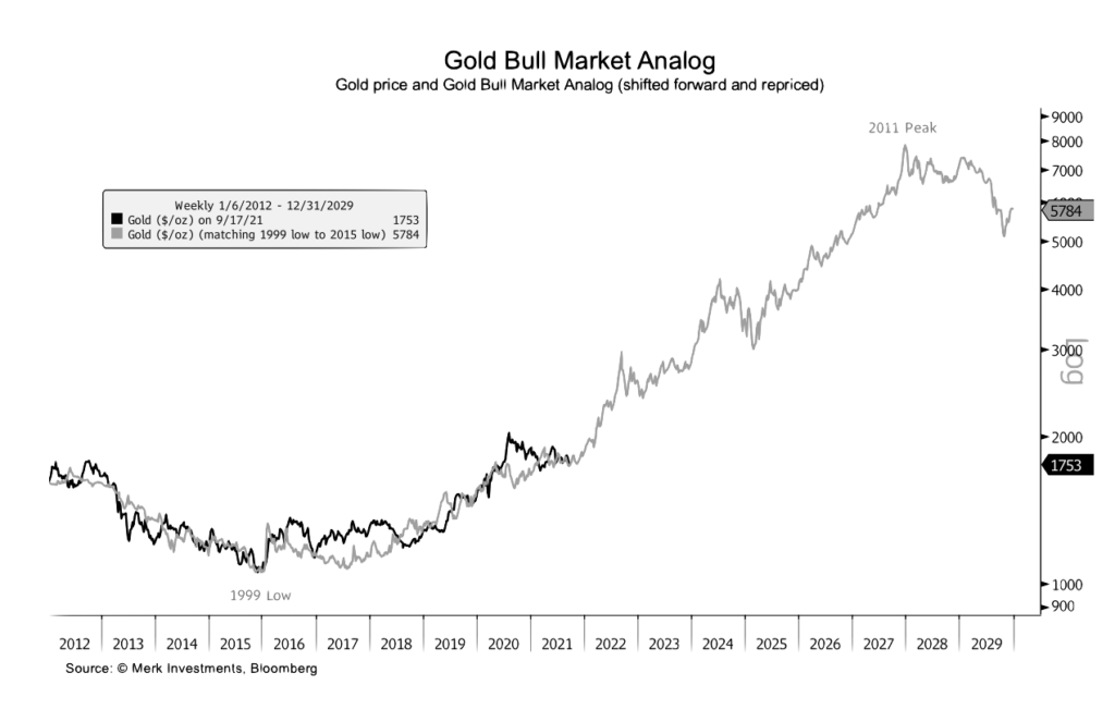
In support of Morris’ contention that “the next decade will belong to gold,” we offer four instructive charts from Merk Investments. The first two show the close correlation between real rates of return and the price of gold. In the past, the declining real rate of return was driven by the rate side of the equation. Now, rising inflation expectations have become the primary influence – a development likely to focus increased attention on the yellow metal. The third chart shows the relationship between long-term growth in the global money supply and rising gold prices. Central bank stimulus is now feeding into the global money supply – something it did not do during the Great Financial Crisis (2008). As a result, we might see an acceleration in both trend lines – money supply and gold. The fourth and final chart is by far the most intriguing. It matches up the cyclical lows posted in 1999 and 2015 and shows gold now closely tracking the trajectory of its twenty-year secular bull market begun in the early 2000s.
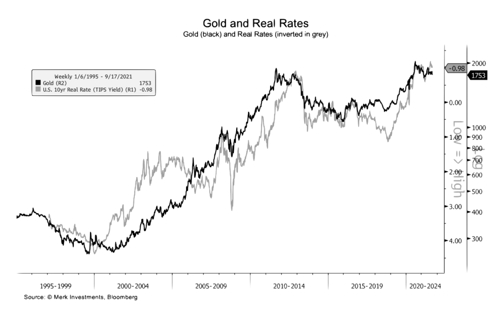
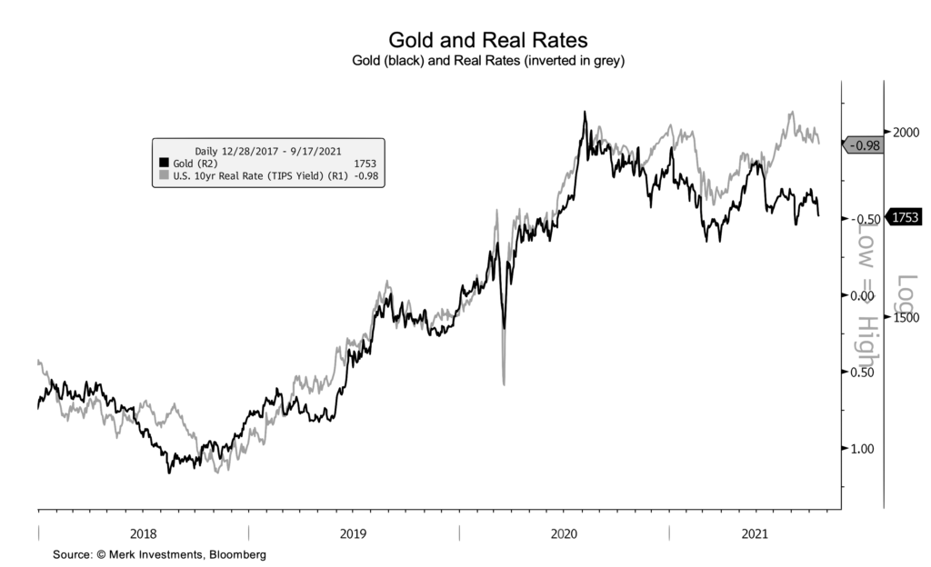
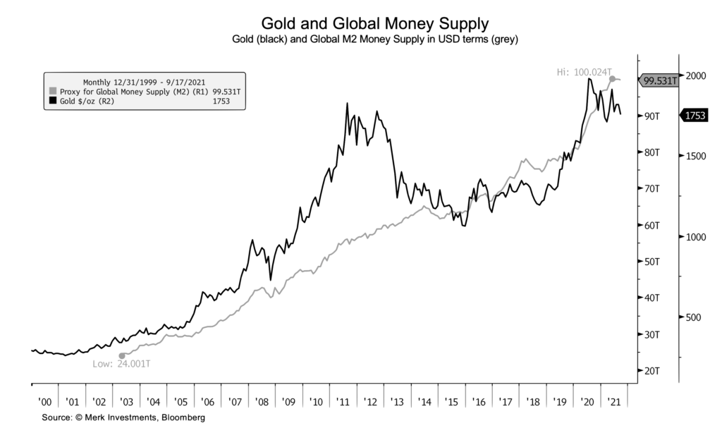
Charts courtesy of Merk Investments • • • Click to enlarge
